
apple Podcasts
Your Queue allows you to customize and access on podcasts on the go.
Adding a Feature
Role:
UX/UI designer
UX Researcher
Tools:
Figma
G-suite
Duration:
1 month
Background
I started to listening to podcasts 3 years ago, when my friend recommended me the Happiness Lab on Apple Podcasts. Not only was I excited to learn new lessons on my morning commute, but I was also fascinated with this new way to consume content. I then began to wonder, how does this new format of media impact user’s lives?
The Problem
Podcast listeners need an accessible way to organize and access their favorite content on the go.
The Solution
The “Your Queue” feature acts as a completely customizable playlist available to on the user’s homepage. This feature allows the user to save time by empowering them to never waste time on sifting through unwanted content.
How did we get here?
1. Research
•
2.Ideation
•
3.Prototyping
•
4. Usability Testing
•
5. Iteration
•
1. Research • 2.Ideation • 3.Prototyping • 4. Usability Testing • 5. Iteration •
Market Research
To catch up with Apple Podcasts’ aggressive competitor, Spotify, we have to understand what is lacking in Apple podcasts' interface to increase user loyalty.
Spotify’s strategy of innovative app turnover, exclusive content, and focus on user discovery and experience has made it the preferred listening app over Apple Podcasts.
-
Their top competitor, Spotify is a powerful streaming application, allowing users to access both music and podcasts. With Spotify overtaking Apple podcast’s long running spot at the #1 podcasting application, I took inspiration from their strategy of targeting and tailoring their power podcast listening user base.
-
While Apple Podcasts takes the lead over Google Podcasts in the market, its helpful to reflect on how Google Podcasts has largely stepped out of the podcasting game. Their application shows little to no changes since 2021 and is rumored to be phasing out as one of Google’s priority products.
-
With a much smaller hold on the market, Pocket Casts hardly plays a threat to Apple Podcast. Still, the application boasts an array of customizable features allowing power users to archive, organize and discover content.

While Spotify’s features are targeted towards power users, Apple podcasts’ is targeted for a more general audience (light users) which focuses on mass engagement but not necessarily user retention.
By starting with power users, we have an opportunity to mirror how Spotify can appeal to both the frequent listeners and those who might one day become frequent listeners. To do this, we have to turn to the user to determine how we can improve user adoption.
user interviews
With the goal of user adoption, we wanted to get to the bottom of what podcast listeners valued. How did podcast listening effect user’s daily lives?
I interviewed 5 podcast listeners between the ages of 24-30 over zoom.
Key Findings
Here is what I found…

5 out of 5 users:
listen to podcasts while commuting or doing an scheduled activity
tend to stick to a certain range of podcasts for a long time

4 out of 5 users:
said driving affects adds factors of time and distraction when listening
desire the newness of podcast content: ie. new content coming out, new episodes, new voices
Podcast power listeners detailed their commitment and deep appreciation to the meaningfulness and educational content of their listening experience. Due to this, listeners are highly selective when choosing the content they spend their time on.
Along with this, podcast listeners frequently schedule their listening time into a specific and limited time of their day, often choosing commutes for this activity. So how do we help users not waste time on searching for their chosen content?
Users said…
“ I get frustrated a lot looking for podcasts, I give up, a lot of the time the podcasts are connected to the podcast that I listened to before in some way.”
— Power Podcast Listener 2
“I usually go back to a podcasts I know. For safety mainly, because I’m so particular I'll have to click through the app. I don’t want to be distracted and be filtering through podcasts while driving..”
— Light Podcast Listener
“When I’m on my commute to work, I have about 20 minutes to commute. I’m literally on this thing for quite some time and by the time I find something that I remotely want to listen to, I’m almost at work.”
— Power Podcast Listener 1
After interviews, we used this POV and HMW to get in the head of our user.
POV & HMW
I want to explore ways to help on the go podcast listeners easily access their chosen podcast content because they have limited time to search with their busy schedule.
How might we help podcast listeners save time in searching for their content when they are on the go?
With our user research findings, Derrick’s persona was created to represent our user base.
Persona
Derrick’s persona shows how pain points like limited commute and a desire to avoid unwanted content impact his listening experience.
Initial Usability Testing
While user interviews gave us an idea of who are user was, we still didn’t know the current problems users had with the current product itself.
To see exactly what users needed, I conducted 3 usability test with podcasts listeners over zoom.
Key Findings
Here is what I found…

3 out of 3 of users:
didn’t know how to queue an episode
didn’t know where the queued episode went
were confused as to where saved episodes went
had trouble finding and navigating their library
Usability testing provided key insights into the particular problems power listeners might face when trying to access their content.
While queuing, saving for later and bookmarking were all options available to the user, they had trouble finding accessing this content after initiating this action.
Ideation

Based on usability testing, market research, and user interviews,
I drafted a feature that would allow the user to access their saved and queued content in a playlist present on their landing page.
I named this feature “Your Episodes”.
Taskflows
In adding a feature to an already existing product, we wanted to make sure that each function allowed the user to achieve their task in the most streamlined way possible
These flows display exactly how the user would carry out the tasks within the feature. Here, we can see how direct and customizable the feature can be. The UI functions are available either immediately on the landing page or within the first page of the feature itself.
Wireframing
Low Fidelity
In low-fidelity, I got to visual how this feature would fit into the current landscape of the application
Placing the feature at the top of landing page optimizes premium visibility. Its customizability includes:
Rearranging Episodes
Deleting Episodes
Adding Episodes from your Library
Searching within Your Queue
Analyzing a existing feature
Presenting this design to my peers, a question arose:
How is this current feature different from the “Up Next Feature” and if implemented, how it would impact this existing feature?

High Fidelity Prototypes
After structuring the feature and analyzing its flow within the existing product we ended up with…
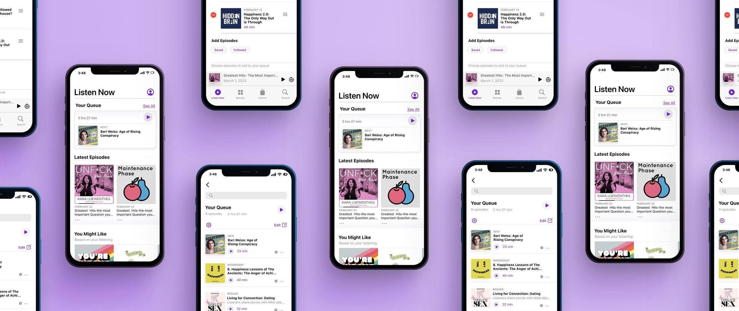
Adding Episodes
Users are able to add any episodes from anywhere in the application.
By clicking on a drop down menu on each episode, they can instantly add the episode by selecting “Add to Your Episodes”.
Editing Your Episodes
Users can customize Your Episodes by clicking edit.
This allows the user to delete one or multiple episodes at a time, as well as rearranging the order.
Adding Episodes within the Feature
The user can easily access previously their saved episodes or shows they follow by scrolling to the bottom of the page.
Here, they can toggle which category they would like, and immediately add episodes from this selection.
Testing & Iterations
To see how users felt about the flow of the feature within the current product, we turned to usability testing. We tasked them with adding an episode from anywhere in the product and with removing and adding episodes from within the feature.
I tested 3 users over zoom for usability testing
Here’s what I found.
-
![]()
Revision 1/2
-
![]()
Revision 2/2


Reflection
I learned that working within an existing product means you have to not only work within the design system, but also the existing flow and goals of the product.
Adding a singular feature might seem like a simpler task, but making sure this new feature justified and helpful was of the utmost importance.
A single feature can completely alter a user’s experience and it was my responsibility as a designer to use user research and market research to find a solution that directly challenged the user’s problem.

Check Out My Other Case Studies!

