
mOKGA
mokga.com is a personal training website for Julia Lin, advertising her budding business MOKGA
Responsive Website
Role:
UX/UI designer
UX Researcher
Content Strategist
Tools:
Figma
G-Suite
Duration:
1 month
Background
Julia Lin is personal trainer based in San Francisco, CA who is currently in the early stages of building the wellness center, MOKGA. She is reaching out to clients to build her clientele base while also ideating how to launch her wellness center.
Needing to have a tangible focul point for her business to launch, we approached her to create a website she could use to present to new clients and to generate buzz for her business concept.
The Problem
The current fitness industry does not offer accessible and alternative paths to wellness for users who desire community and self care.
The Solution
A website that communicates a clear brand vision for the future of the business while also allowing opportunities for users to engage in an instantly .
How did we get here?
1. Research
•
2.Ideation
•
3.Prototyping
•
4. Usability Testing
•
5. Iteration
•
1. Research • 2.Ideation • 3.Prototyping • 4. Usability Testing • 5. Iteration •
Aligning with the client
Before delving into the design process, we synced with the client to align her business goals to our design approach.

Market Research
Each of the businesses below reflect an aspect of MOKGA:
Diakadi reflects the fitness industry.
Community Well reflects community and wellness.
Balay Kreative reflects culturally accessibility.
-
With a strong client base and a heavy focus on wieghtlifting and physical fitness, Diakadi is displays how a typical fitness center can get through to its clients. Their website provides structred programming and client testimonials to entice potential customers.
-
Community Well offers a vast array of health and wellness opportunities. Appearing to be a resource for those looking for local health and wellness services, the content heavy and clunky UI of the website leave room for improvement. When first exploring the website, it is unclear the intention and purpose of the business itself.
-
Balay Kreative is geared toward the development and representation of a minority community by utilizing many forms of art and revenue, grants, and programs. While their website fully fleshes out Balay’s philosophy, their is not a direct way for user engagement.

What differentiates MOKGA from all three businesses is that it unifies these aspects together.
During market research, we struggled to find a direct competitor for MOKGA’s concept. This was an opportunity to draw inspiration from each businesses’ tactics while directly pinpointing this whole in the market.
user interviews
To discover what strategy to use in filling this whole in the market, we needed to turn to our users to find out exactly what they are missing.
I interviewed 5 users, interested in exploring their fitness, between the ages of 24-30 over zoom.
Key Findings
Here is what we found…
5 out of 5 users:
say the impersonal nature of standard gym practices intimidates them
say that a busy schedule affects their ability to maintain fitness practices
4 out of 5 users:
think there’s a lack of representation within fitness and what can genuinely benefit overall health
prefer fitness spaces with a strong sense of community
Users expressed that both the logistic and personal aspects of their experience could use improvement.
To gain user trust, transparency in programming, location and pricing is essential. To build user adoption, an emphasis on community and personalization could prove to be a successful strategy.
Users said…
“If I could choose I wouldn’t choose a gym. I want to choose more like rock climbing, or gymnastics because it doesn’t feel sterile. I like community and direction, the gym is mainly self directed.”
— Class pass User
“When you go to gym it is a little intimidating and it makes me not want to go. It’s more male dominated and since I don't know certain machines, I don’t want them think I don’t know what I’m doing.”
— intermittent Gym goer
“Working with a personal trainer is kind of intimidating! I will only do something (fitness/training) if its vetted by someone that I know”
— Frequent Fitness Explorer
POV & HMW
After interviews, we used this POV and HMW to get in the head of our user.
I'd like to explore ways to help busy individuals incorporate creative paths to wellness into their life so that they might find a comfortable place to explore their body because there is not currently a place for this in the current wellness industry.
How might we help busy individuals incorporate creative paths to wellness into their packed schedules because there is not an accessible place for them to do this currently?
Persona
With our user research findings, Sage’s persona was created to represent our user base.
Sage’s persona shows how pain points like budgetary restrictions and a fear of fitness standards impact her willingness to explore her wellness.
Ideation & Information Architecture
With the discoveries of the user’s primary pain points, we began to ideate possible solutions to address them directly.

Sitemap
Based on the ideations above, I collaborated with the client to structure her website in way that made sense both to her and her potential clients.
Userflows
Since one of Julia’s main business goals is to build her clientele base we created this flow to focus on getting users to book a consultation. This flow shows how the user can book a consultation from various paths of the website. Which guided how we wire-framed.
Wireframing
Low Fidelity
In low-fidelity prototyping, I was able to get a birds eye view of how to combine user-flows, sitemaps and our primary features.

After fleshing out the primary pages of the desktop website, I began to wireframe the mobile version. Using a 4 column grid, I repurposed the desktop designs for a mobile screen
Brand & UI Design
Heading into the brand design, the client wanted the business to be
RETRO-TO-CHILDHOOD
PLAYFUL
FUNCTIONAL
CALMING

Julia said she wanted the vibe of her website to be playful, like how you would feel when playing an arcade game or an old version of Super Mario Cart.
We used photos that the client sent over to get an idea of what inspires her and that she felt represented her brand. I pulled colors directly from these photos to choose the color theme and text:
orange for primary background colors to give the website an overall warmth
green as a secondary background and card color for a calming and natural feel
purple pink as the accent color for a hint of playfulness
Rubik and Concert One logo and body text of the website as they are reminiscent old style arcade games
Crafting Content
It was essential that the content on the website not only accurately represented the business from my client’s perspective but also that it could communicate it in a way any user could understand.

Through 3 collaborative working sessions with the client, we defined:
the mission
her story
the vision for MOKGA
her training style
her programming structure
After gathering crafting brand and content with the client we came up with…
High Fidelity Prototypes
Landing Page
Serving as the first impression that the website would have on the user, I made the 3 most important aspects of the business visible on this page:
Personal Training
Julia and MOKGA’s Vision
The MOKGA Pop-up
For user engagement, I added social media links and a message form to connect the user directly to Julia.
Personal Training to Booking
From discovering that users valued transparency and detailed programming when pursuing service, I crafted a page that would inform users:
What Julia’s personal training would entail
How programming would work
Her credentials
Pricing and availability
Intake form
The Mission
The mission page ties together how Julia’s story impacts her vision of what MOKGA will come to be. This page also outline her fitness philosophy and ties into how this impacts her personal training programming.
Events Page
From the landing page, the user can also learn more about the MOKGA Pop-up. On this page the user can RSVP directly to a list of vendors.

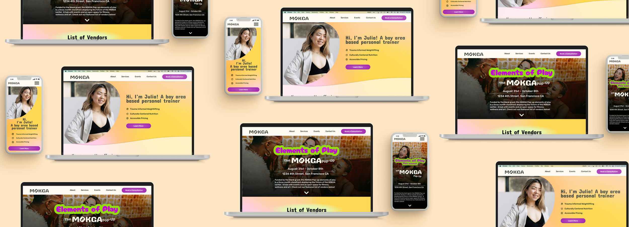
Responsive Design: Mobile
Making sure users would be able to access her website on the go, we adapted these designs for mobile users.
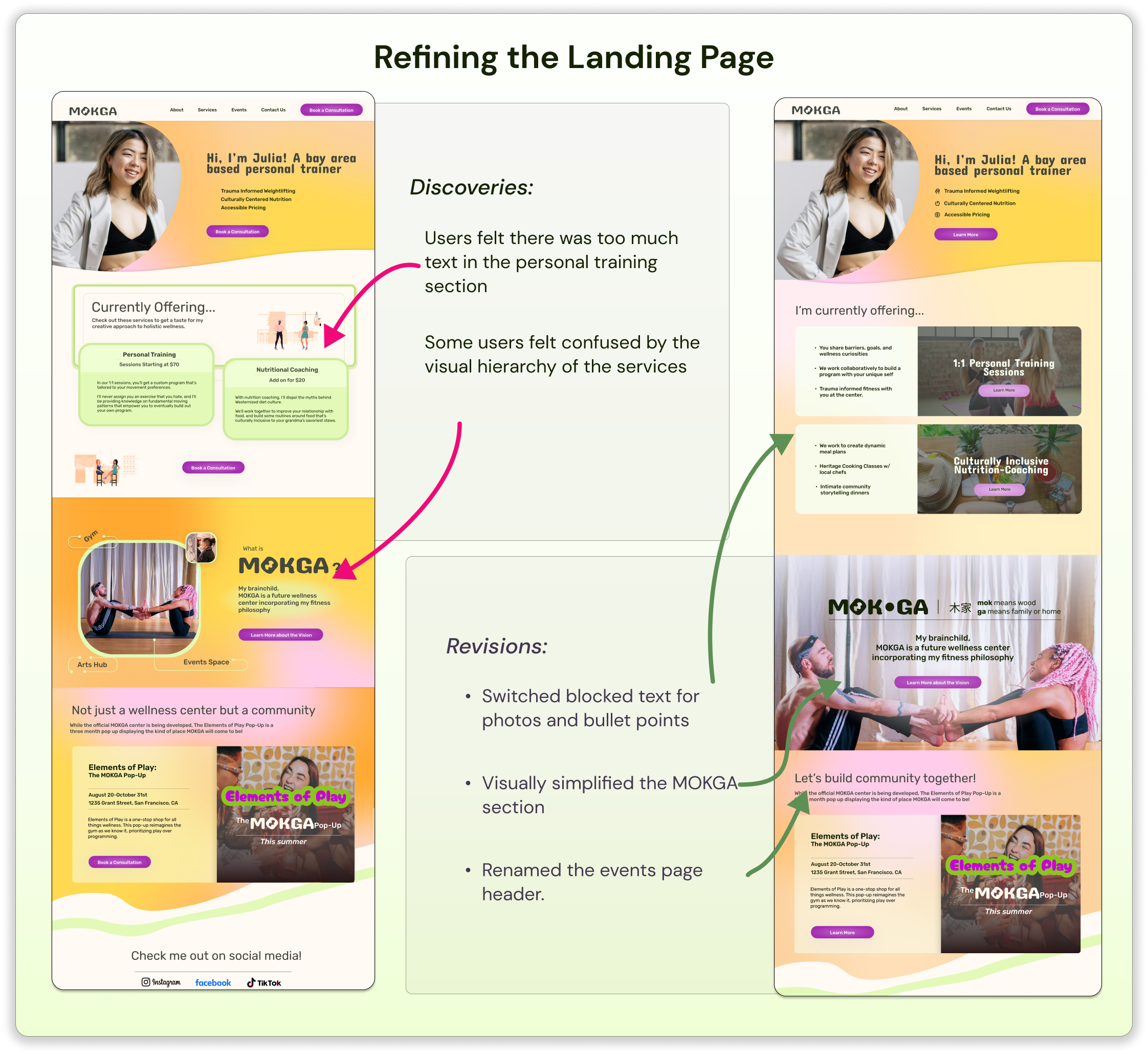
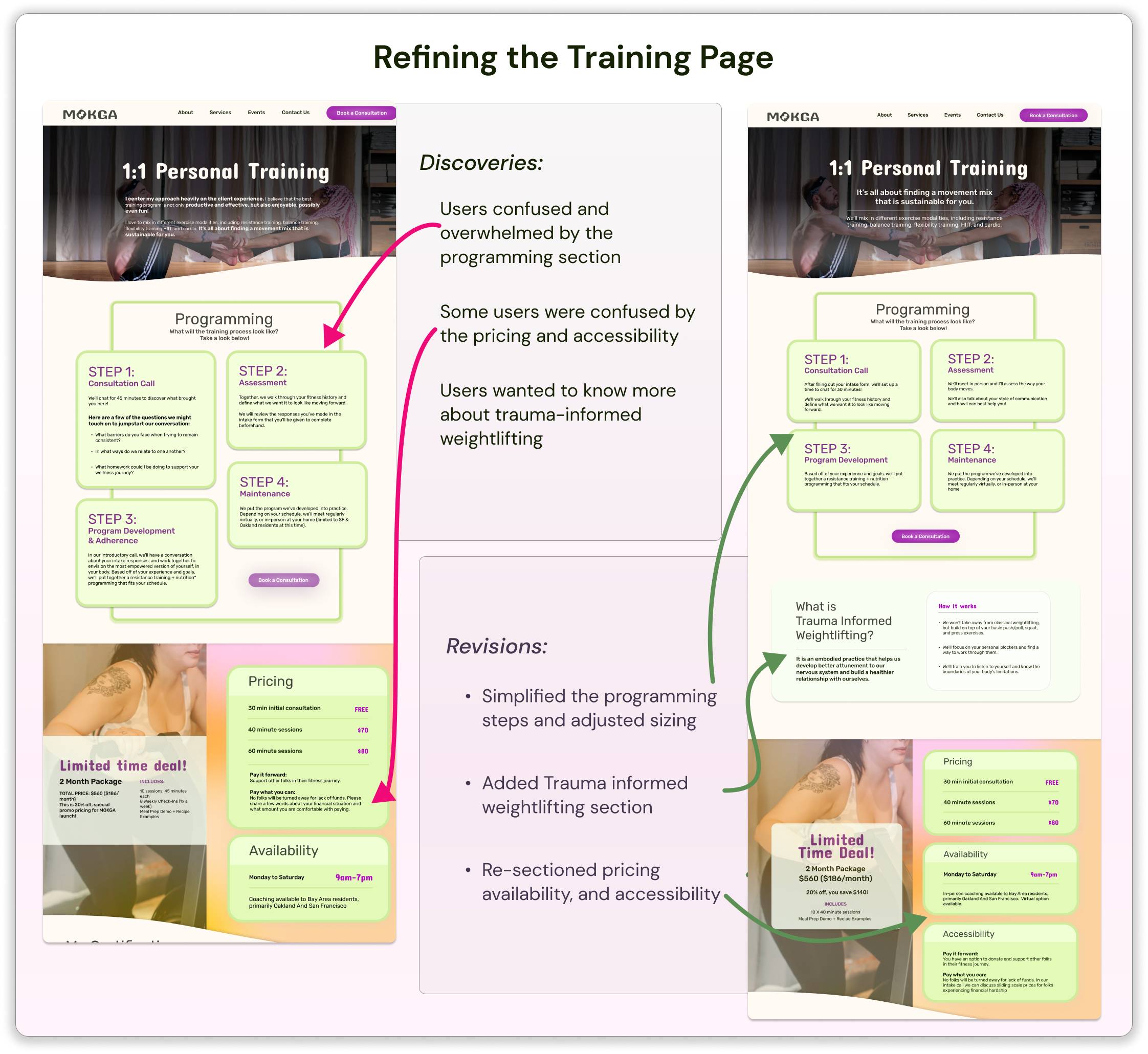
Testing & Iterations
I tested 3 users over zoom for usability testing
Here’s what I found.
-
![]()
Revision 1
-
![]()
Revision 2
Reflection
Working with a client, this process taught me to be flexible and collaborative. While I had my own creative choices and desire for a specific direction, I had to make sure that every choice I made aligned with the client’s vision and process as well.
While the overall process went smoothly, there were point I had to revise my work based on the client’s request. This was a great reminder that while I have a great responsibility as designer, I am only one part of a team.


